Project report: NIKE ‘House of Innovation’ brand mark Brad Turner. July 26, 2019.
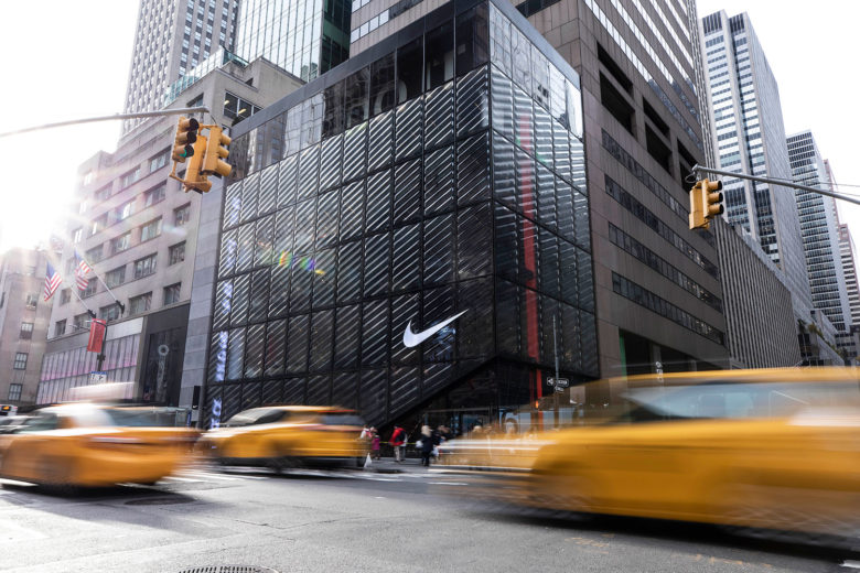 ‘House of Innovation 000’, New York. Image courtesy of NIKE.
| Client: Nike Project: ‘House of Innovation 000’ brand mark |

|
Recreating the excitement the original NikeTown generated when it opened its doors in London 20 years ago, NIKE’s latest New York flagship ‘House of Innovation 000’ once again aims to transform the retail design landscape. As part of the group’s mission to reimagine everything that is NIKE retail, Materials Council were commissioned to help design the iconic ‘Swoosh’ that adorns this spectacular store.
Symbolising everything NIKE represents, the demands of the brand mark are manifold. We were challenged to create a material-led solution that embodied NIKE’s values of “strong, light and lean”. The solution had to be premium. It had to be innovative. And it had to capture people’s attention.
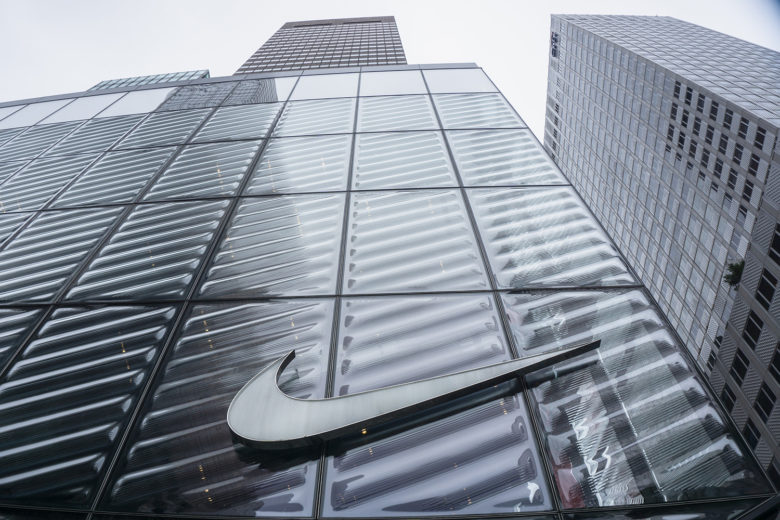
We helped create a design animated by the energy of the streets of New York and the motion of the people passing byIt’s fair to say this was an exciting project for us to be involved in. Materials Council was going to have a little piece of 5th Avenue to our name. With an iconic brand, no less. To come up with a solution that would meet the high demands of this prestigious project, to create something special whilst not detracting from the iconic brand mark itself, was an exciting and intimidating task. One that we relished.
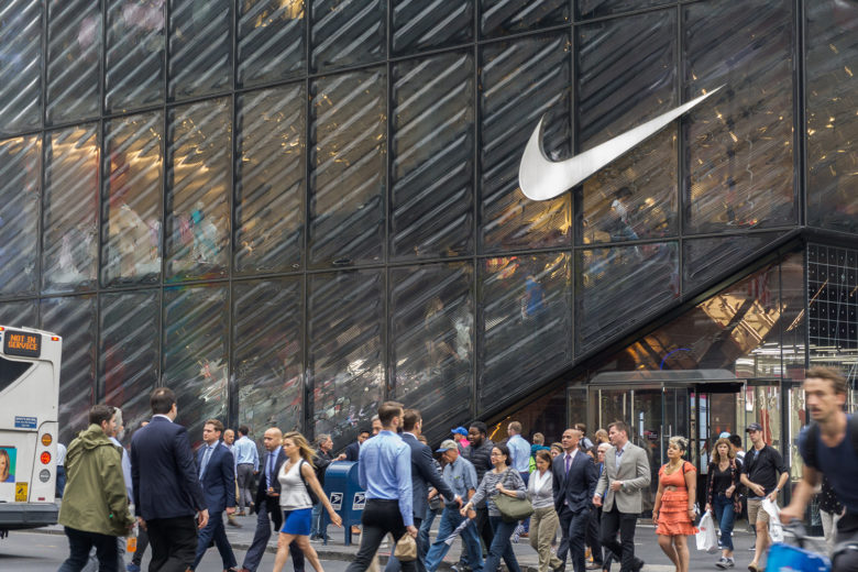
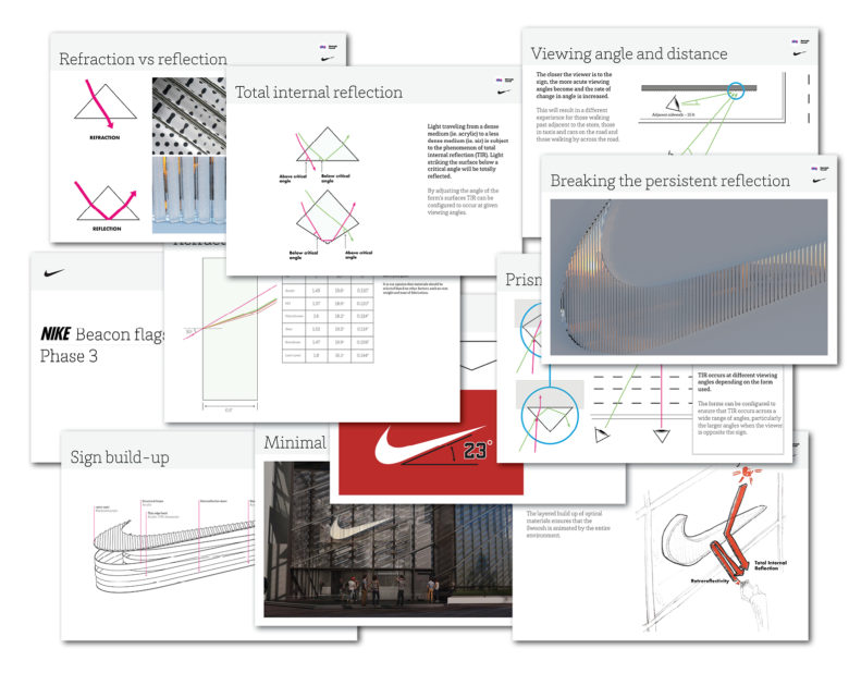
After extensive exploration with the design team, we focussed on materials with intriguing optical effects that could generate a quality of motion. Through experimentation we evolved this concept and developed a combination of prismatic materials that create a surface that gently shimmers and animates, transitioning between silver, white and grey using the optical phenomenon of total internal reflection as the viewing angle changes. The surfaces also reflects the activity around it – flickering with the light of passing taxis and sparkling with the golden hues of the setting sun.
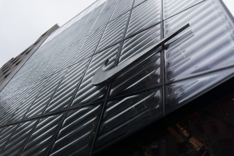
Viewed from a stationary position, the surface has a subtle gradient across it. Viewed in motion the effect is quite striking. This passively-dynamic effect works in harmony with the beautiful slumped glass ‘motion skin’ facade that is the defining element of the building.
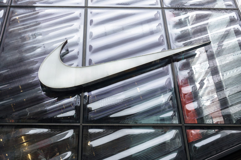
The brand mark design has also been employed on the first House of Innovation to complete construction, Shanghai 001.
